BUDGETING TIP OF THE MONTH
Visualizations
Visuals assist a great deal when providing and presenting financial metrics to an audience. Their ability to help identify and summarize key drivers in reports allow individuals to maintain focus on the presenter’s evaluation.
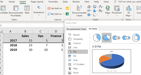
Some easy visuals available to use in Excel can be found under the 'Insert' > 'Charts' ribbon.
Pie charts are one of the best visuals to represent portions that contribute to the whole value. Simply highlight the range of data for your chart, then select ‘Pie’ under the Charts section.
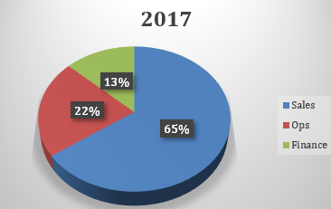
Here we are able to create a pie chart summarizing the total percentage of employees by department within a firm in 2017.
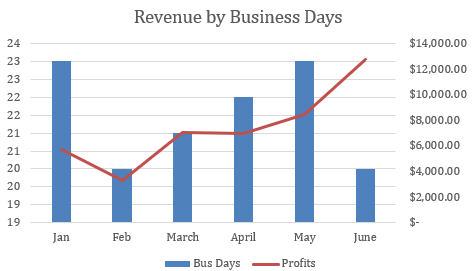
Mixed or combination charts are created in a similar fashion. Below you'll see an option for displaying multiple attributes of a particular data set.
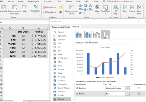
In this chart, we are able to see monthly revenue by number of business days from January to June.